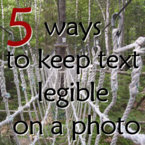
Various projects will require you to add text on top of a photo. Although it is easy enough to add some text on a very wide and light sky, sometimes, the photo is busy, and there isn’t any wide space to add legible text. What to do?
The simple method
The most obvious methods are always to put text on a wide area that is mostly uniform in color so you can use a contrasting color for the text, but not every photo offers that possibility. Or maybe, there is a purpose in using a text color that is not contrasting with the photo.
Think ahead – choose the font
Whatever method you will be using for your text, remember that size matters. Very small size text, fine or very fancy fonts will always be challenging on a busy photo, so if you are able to choose a more standard font, in a large size, it will help with the legibility from the start. Even then, sometimes, the text will need some extra help to stand out. If that is your issue, consider one of the following tricks.

1- Decrease the contrast of the photo
If you are able to add a white layer right above the photo, you can lower the opacity considerably (around 15% or so, depending on the photo) so your text will have a chance to stand out a bit more.
Of course, if you want to showcase the superb colors of a magnificent sunset, you might not want to tone down those colors. In those instances, you can choose another method.

2- Use a partial overlay
Instead of covering the whole photo with a white overlay, consider placing a white strip only where the text is. This method is particularly useful when the text is limited to a few lines either together (like in the center) or near the top or the bottom.
This allows you to showcase the vivid colors you are so proud of.
 3- Add an outline to the text

Adding a fine stroke (or outline) to the text might work to make it stand out, especially if the image below is as dark or light as the text. A white text on a light blue sky will definitely benefit from a dark outline, and black text can use a white outline in a dark photo.
One drawback of this method is that it makes the text “busy” on an already “busy” background. This is best used in a photo where you want to use dark on dark or light on light, for whatever reason.
The result from this method will also depend on the font used: a large font will be better than a thin one as a thin font might be overpowered by the outline, even if it is only a fine one.
 4- Add a contrasting shadow

Traditionally, a shadow is dark and this will likely work very well with light text on a light background. If, on the other hand, you have dark text on a dark photo, a white shadow will be best.
This will give a result similar to adding a contrasting outline, but since it will be on one side only, it will look less busy (and you can also reduce the opacity, unlike an outline).
5- Add a blurred shadow

One way to combine the advantages of the contrasting shadow and the contrasting outline without overpowering the text is to add a blurred shadow.
There are two basic (and simple) methods to achieve this effect. The first one is to add a regular drop shadow with no offset, and a very large blur on a separate layer. You might need to duplicate that layer to get the effect you want, depending on the photo you have underneath.
The other method is to duplicate the text layer, and once rasterized, increase or decrease the brightness so you get either a white or black text, and then add a Gaussian blur. A setting of only 3 to 5 might be enough to make the text stand out from any busy background.
Did you like the tips in this article? Share it around. Everyone can use these tips.